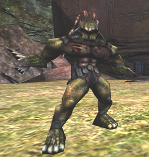
I'm not really keen on using the Unreal Enemy template here. As you can see on the left-hand side, only 25% of the space is used for text, bringing scrolling distances to a maximum. Furthermore, the infobox doesn't really add anything. Health and melee damage were already mentioned and the projectile damage, abilities and appearances are pretty much the same for every Skaarj. It just adds a ton of space and no info. --Kaithofis 16:52, 18 January 2009 (EST)
- I'm
 Neutral. --GreatEmerald 16:56, 18 January 2009 (EST)
| Skaarj Scout | |
| Health | 180 |
| Projectile Damage | 10 |
| Melee Damage | 14-30 |
| Abilities: | Feign Death, Roll |
| Main Appearances: | |
I think it could work if the picture was shrunk considerably. The simple addition of a |center|150px in the image can really make this considerably neater. It could possibly even be scaled down to 125 or 100.
Generally, though, I'm ![]() Neutral to the whole thing, but if this is done, it could definitely be a nice balance. --Dark Pulse 14:12, 20 January 2009 (EST)
Neutral to the whole thing, but if this is done, it could definitely be a nice balance. --Dark Pulse 14:12, 20 January 2009 (EST)
- Wow, why didn't it work for me when I tried to scale it down? By the way, a Warrior, not a Scout should be displayed there. --GreatEmerald 15:24, 20 January 2009 (EST)

